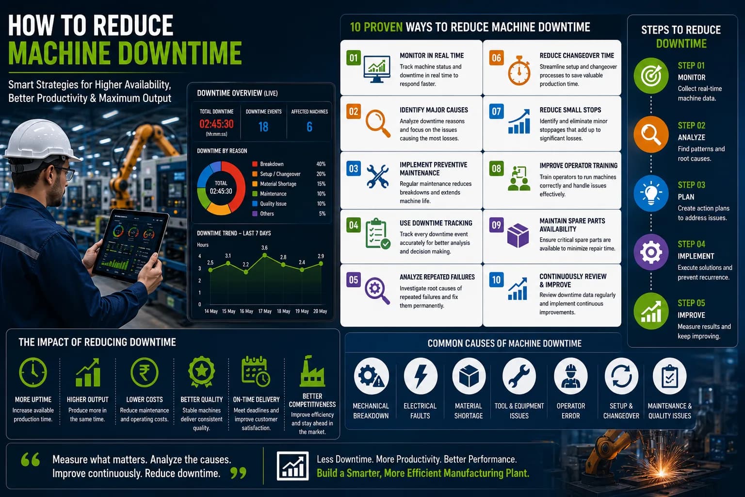

Manufacturing plants generate large amounts of production and machine data every day. Among this data, downtime information is particularly important because every unnecessary machine stoppage can reduce production capacity, delay orders, and increase operating costs.
However, collecting downtime data is only the first step.
Production and maintenance teams need a clear way to understand that information and identify where action is required. This is where a downtime KPI dashboard becomes valuable.
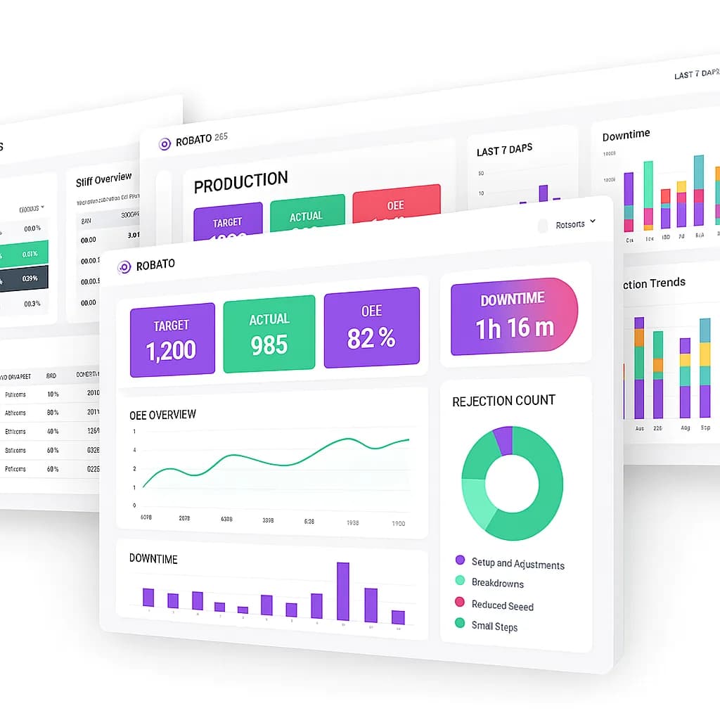
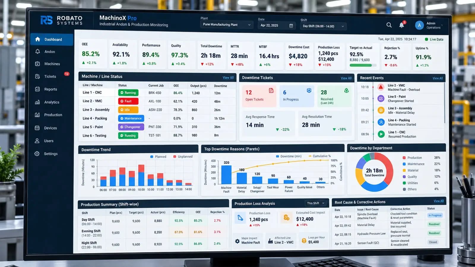
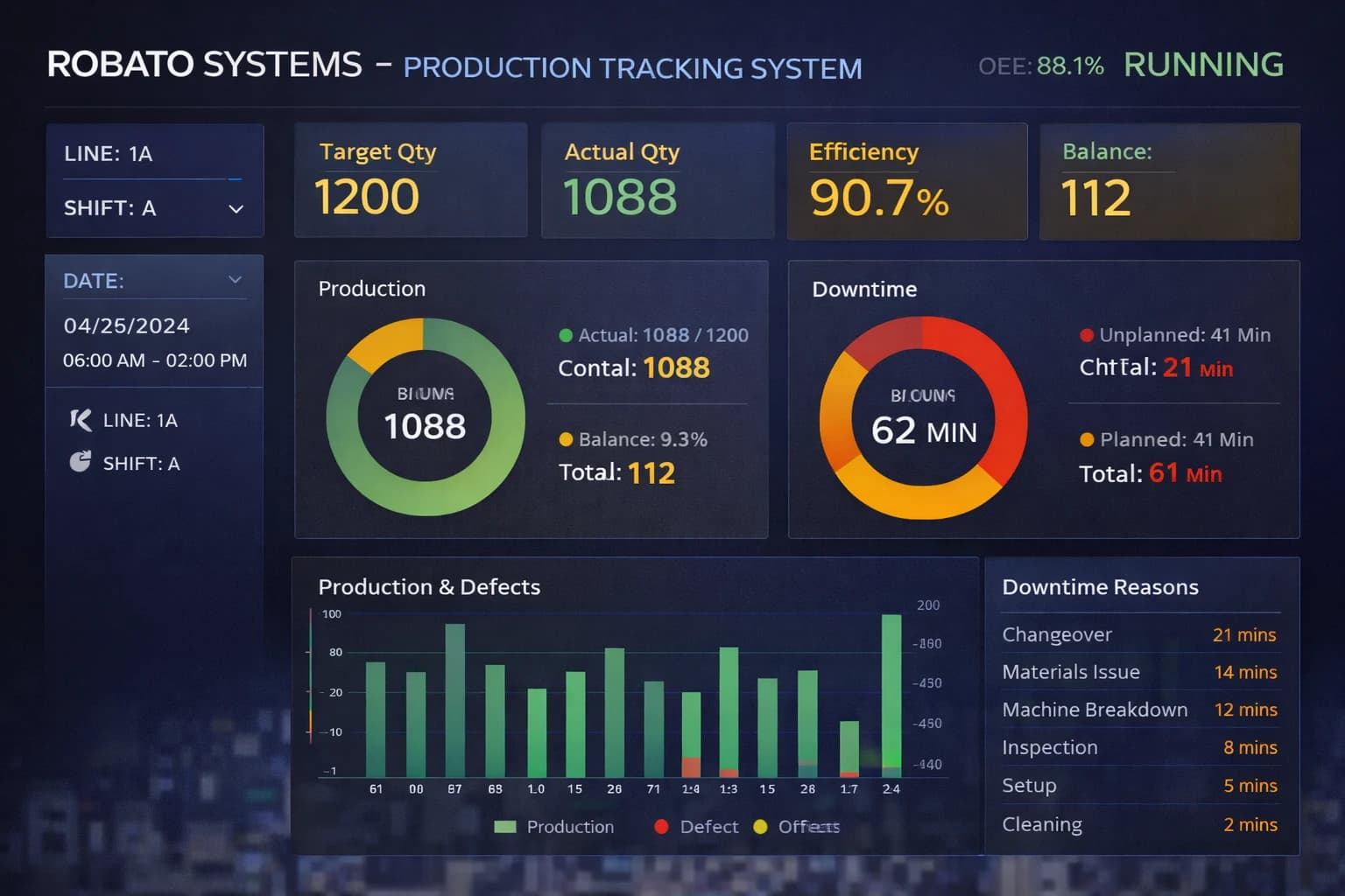
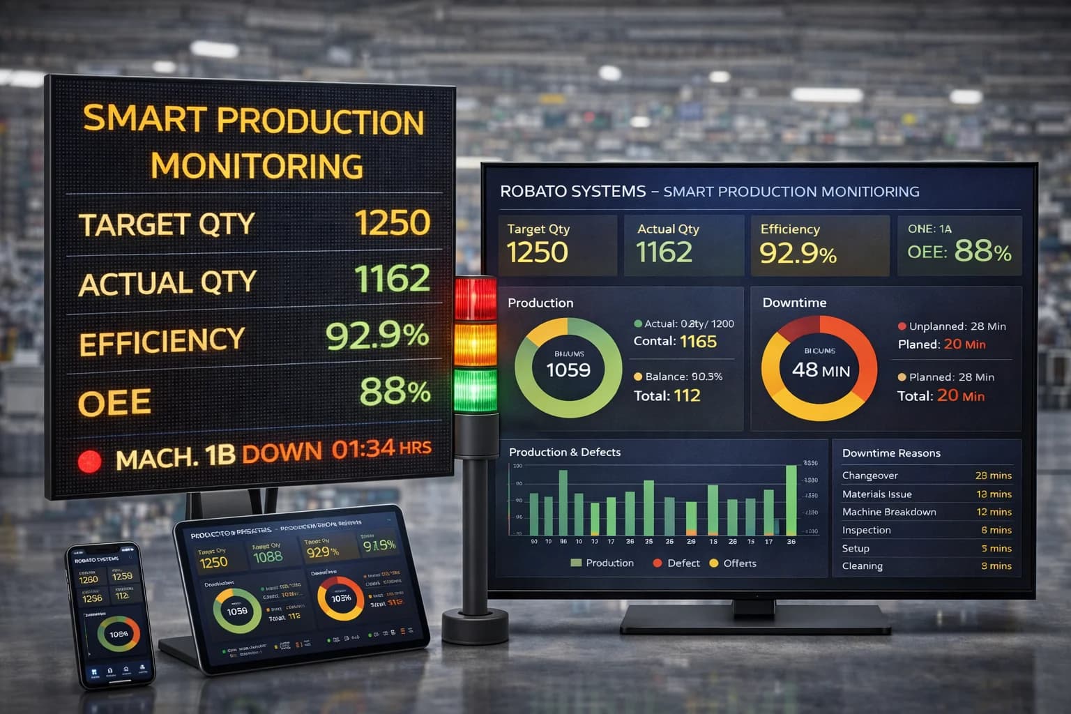
A well-designed downtime dashboard brings important machine and production indicators into one centralized view. Instead of reviewing spreadsheets or manually calculating reports, managers can quickly see which machines are stopping, how long they remain stopped, what causes the downtime, and whether performance is improving.
This guide explains how to design an effective downtime KPI dashboard, which metrics should be included, and how manufacturers can use dashboard information to reduce production losses.
What Is a Downtime KPI Dashboard?
A downtime KPI dashboard is a digital dashboard that displays key performance indicators related to machine and production downtime.
It converts raw downtime data into visual information that production, maintenance, and plant management teams can understand quickly.
A typical dashboard may show:
- Total downtime
- Number of downtime events
- Average downtime
- Maximum downtime
- Machine-wise downtime
- Reason-wise downtime
- Shift-wise downtime
- Planned downtime
- Unplanned downtime
- Downtime trends
- Machine availability
- Production loss
The objective is to provide actionable visibility into downtime rather than simply displaying large amounts of raw data.
Why Is a Downtime KPI Dashboard Important?
Downtime can occur for many reasons, and different problems require different solutions.
For example, a factory may have high downtime because of:
- Mechanical breakdowns
- Electrical failures
- Material shortages
- Tool changes
- Setup delays
- Quality problems
- Operator availability
- Maintenance activities
- Changeovers
Without a dashboard, identifying the most important cause can take considerable time.
A downtime KPI dashboard helps managers quickly identify the biggest contributors to production loss.
Essential Downtime KPIs for a Manufacturing Dashboard
The effectiveness of a downtime dashboard depends heavily on the KPIs selected.
Too few KPIs can hide important information, while too many can make the dashboard difficult to understand.
The following metrics are particularly useful.
1. Total Downtime
Total downtime represents the cumulative amount of time machines or production lines were unavailable during a selected period.
For example:
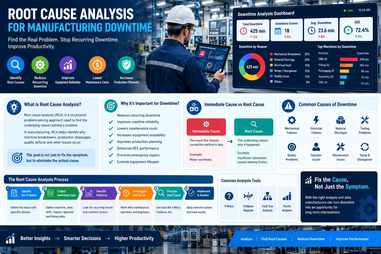
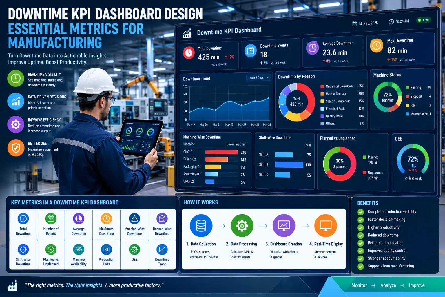
Total Downtime: 425 minutes
This is one of the most basic downtime KPIs and provides an immediate indication of lost operating time.
The dashboard should allow users to view total downtime for different periods, such as:
- Current shift
- Today
- Yesterday
- Current week
- Current month
2. Number of Downtime Events
Total downtime alone does not tell the complete story.
Consider two machines:
Machine A: 120 minutes from one event
Machine B: 120 minutes from 20 events
Both have the same total downtime, but their problems are very different.
The number of downtime events helps identify machines experiencing frequent stoppages.
3. Average Downtime
Average downtime indicates how long a typical downtime event lasts.
For example:
Total downtime = 300 minutes
Downtime events = 15
Average downtime:
20 minutes per event
This KPI can help production teams understand whether downtime events are generally short interruptions or major stoppages.
4. Maximum Downtime
Maximum downtime identifies the longest individual downtime event during a selected period.
For example:
Maximum Downtime: 82 minutes
This can help managers investigate major breakdowns and production interruptions.
Long downtime events may require escalation, detailed root cause analysis, or maintenance improvement.
5. Machine-Wise Downtime
Machine-wise downtime is one of the most important views in a downtime dashboard.
Example:
| Machine | Downtime |
|---|---|
| Machine A | 65 min |
| Machine B | 145 min |
| Machine C | 32 min |
| Machine D | 210 min |
This immediately highlights Machine D as a high-priority machine.
Managers can then investigate its downtime reasons and maintenance history.
6. Reason-Wise Downtime
Reason-wise downtime shows why machines are stopping.
Common categories include:
- Mechanical breakdown
- Electrical breakdown
- Material shortage
- Setup
- Changeover
- Tooling
- Quality issue
- Maintenance
- Operator-related delay
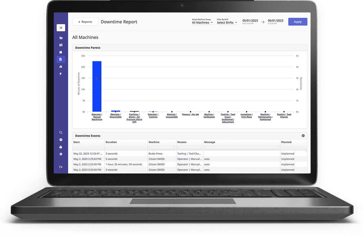
A bar chart or Pareto chart can be particularly useful for displaying this information.
For example:
Mechanical Breakdown - 35%
Material Shortage - 25%
Changeover - 18%
Quality Issues - 12%
Other - 10%
This makes the biggest downtime contributors immediately visible.
7. Shift-Wise Downtime
Manufacturing plants operating multiple shifts should include shift-wise downtime.
For example:
| Shift | Downtime |
|---|---|
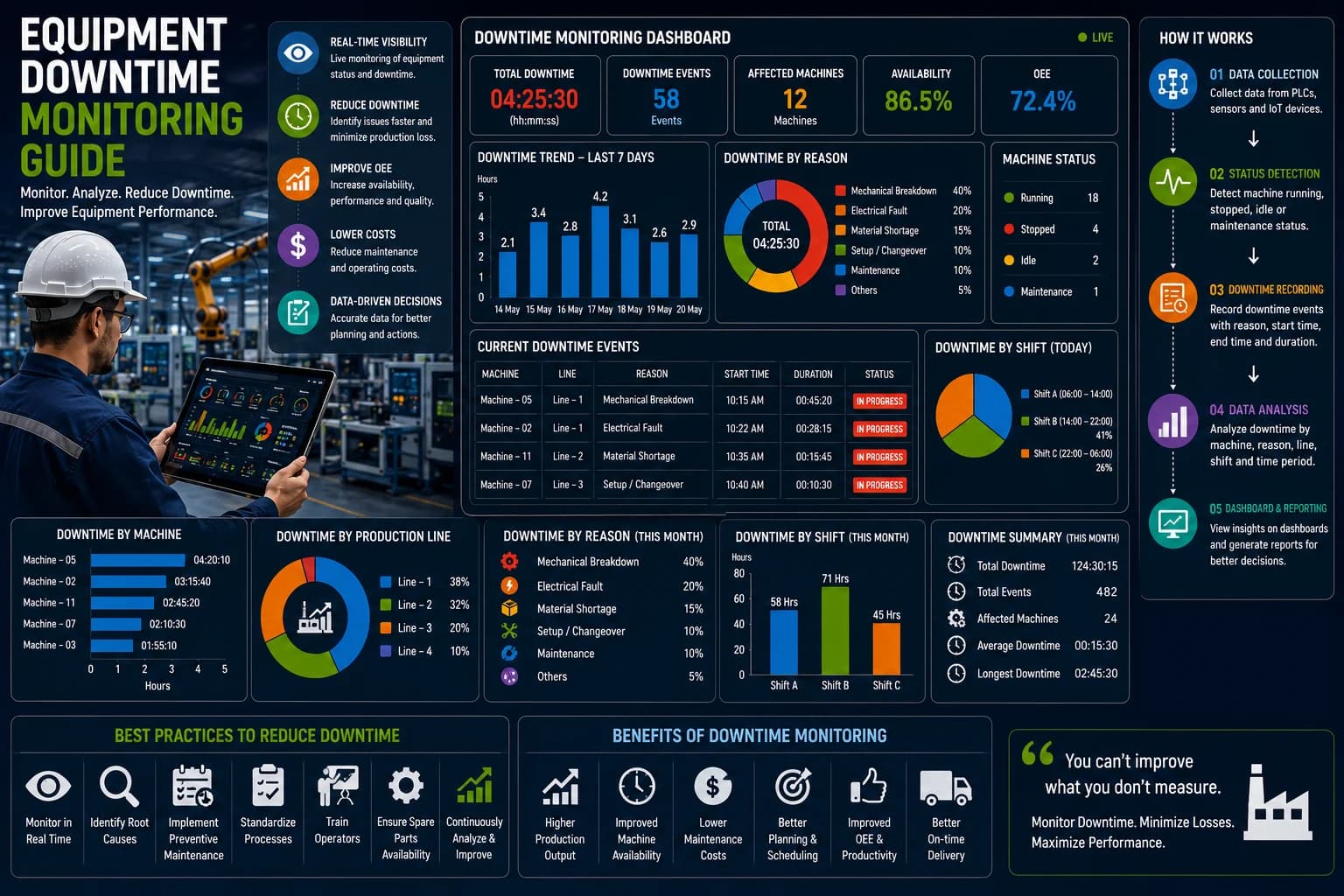
| Shift A | 75 min |
| Shift B | 130 min |
| Shift C | 55 min |
If one shift consistently records higher downtime, management can investigate potential causes.
These could include:
- Maintenance availability
- Operator training
- Material supply
- Machine setup
- Shift handover
- Production scheduling
8. Planned vs Unplanned Downtime
A good downtime KPI dashboard should distinguish between planned and unplanned downtime.
Planned Downtime
Examples include:
- Scheduled maintenance
- Planned changeover
- Cleaning
- Inspection
- Scheduled production breaks
Unplanned Downtime
Examples include:
- Unexpected breakdown
- Machine failure
- Electrical failure
- Tool failure
- Unexpected material shortage
This distinction prevents planned activities from being incorrectly interpreted as equipment failures.
9. Downtime Trend
A trend chart can show how downtime changes over time.
For example, managers can compare downtime across:
- Days
- Weeks
- Months
A decreasing trend may indicate that improvement actions are working.
An increasing trend may indicate that machine reliability or production conditions are deteriorating.
10. Machine Availability
Machine availability indicates how much of the planned production time the machine was actually available for operation.
Availability is particularly important because it is one of the core components of OEE.
Monitoring availability alongside downtime helps managers understand the impact of machine stoppages on overall equipment performance.
Downtime KPI Dashboard Layout
A good dashboard should present the most important information first.
A practical structure could be:
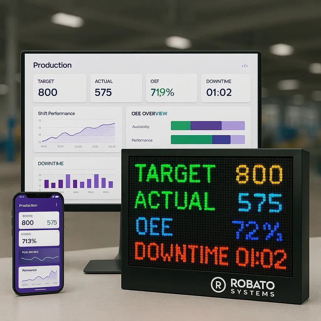
Top KPI Cards
- Total Downtime
- Downtime Events
- Average Downtime
- Maximum Downtime
- Machine Availability
Middle Section
- Machine-wise downtime
- Reason-wise downtime
- Shift-wise downtime
Lower Section
- Downtime trend
- Recent downtime events
- Longest downtime events
- Production loss analysis
This hierarchy allows users to understand overall performance before investigating detailed information.
Real-Time Downtime Dashboard
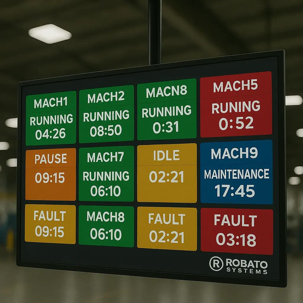
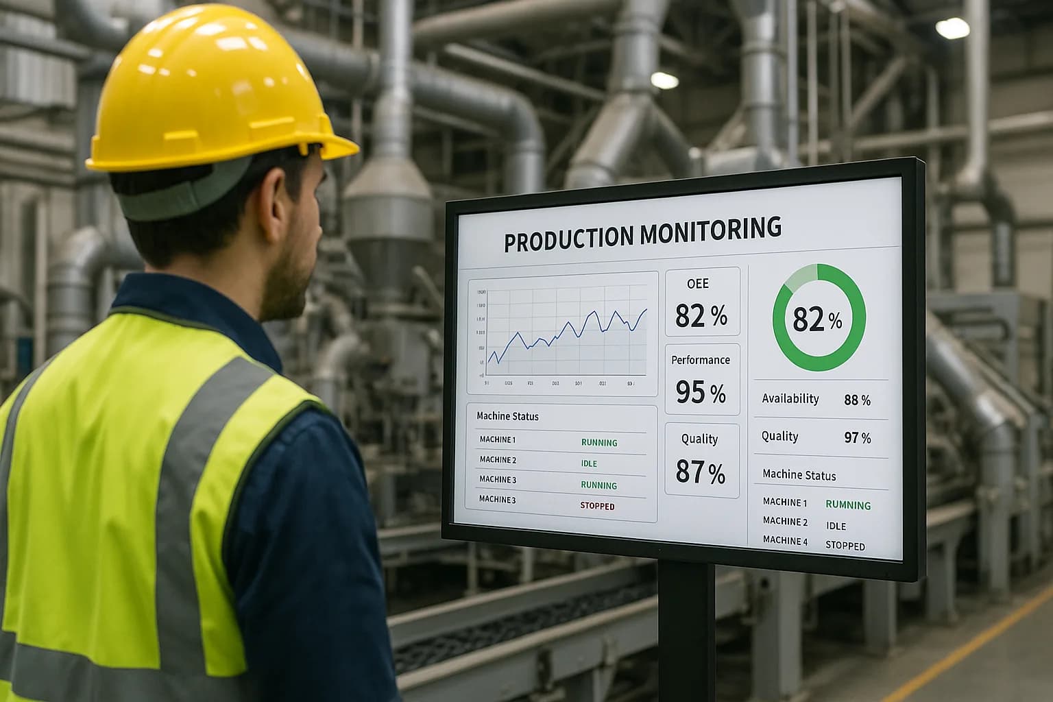
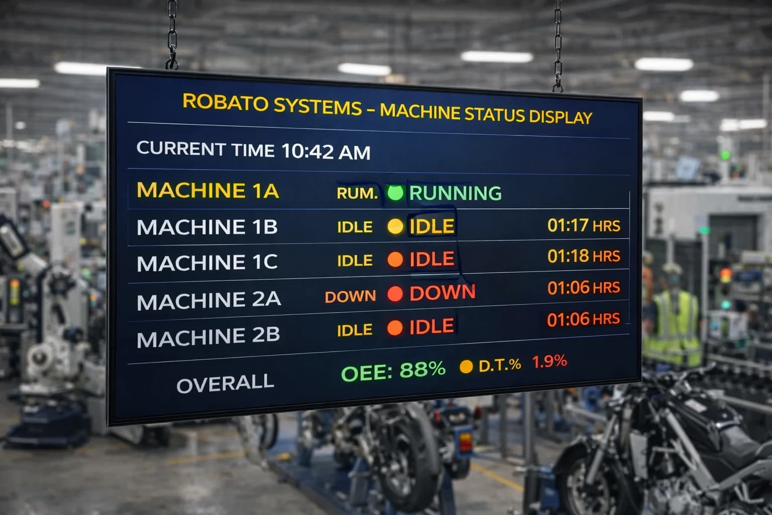
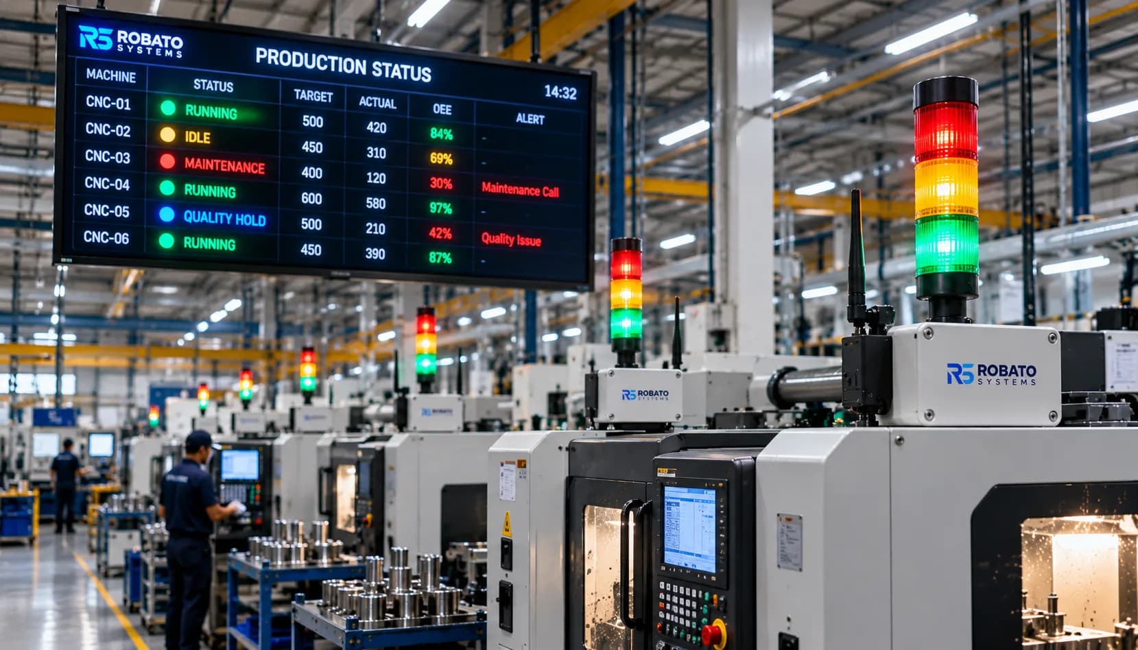
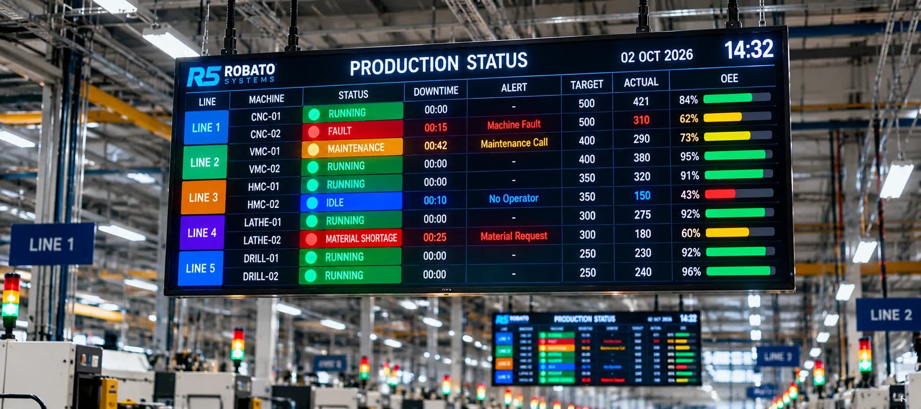
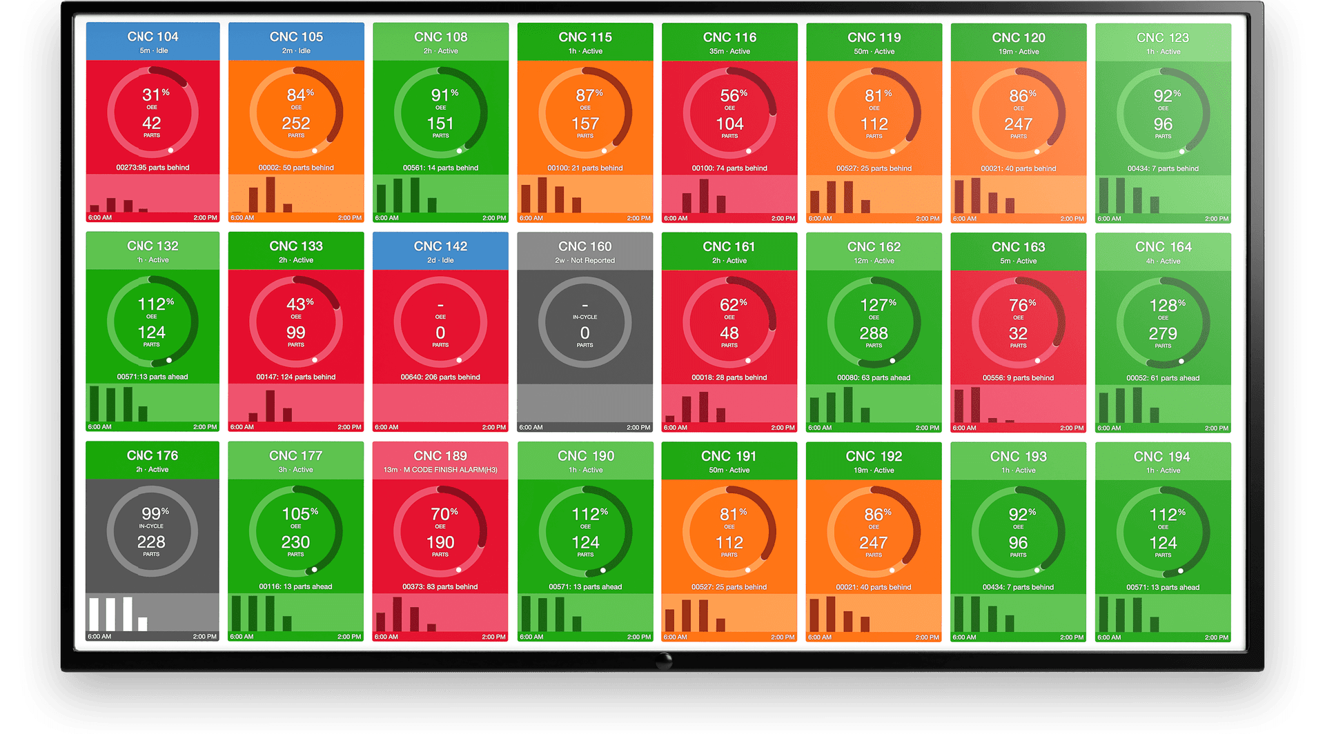
A modern downtime KPI dashboard should ideally provide real-time machine information.
For example:
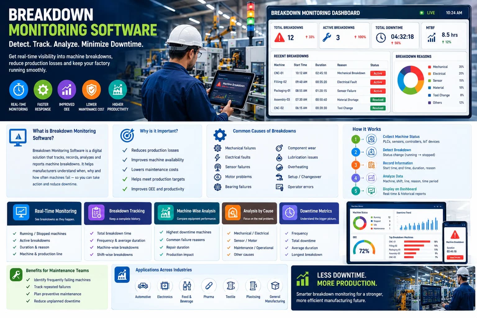
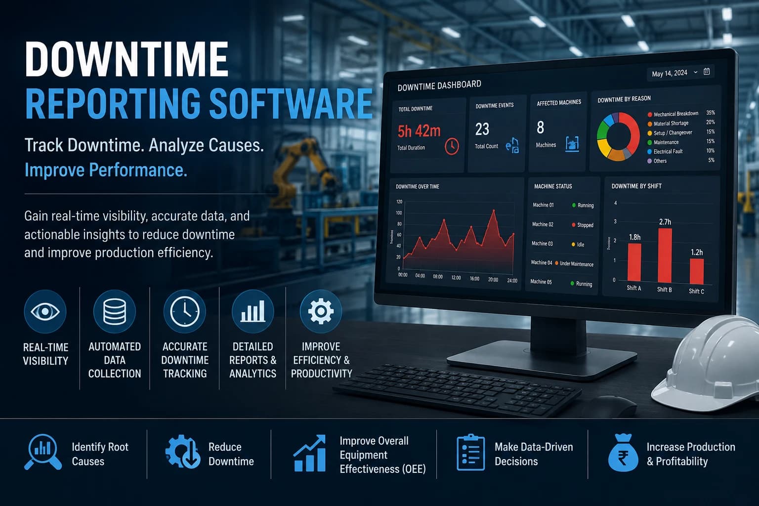
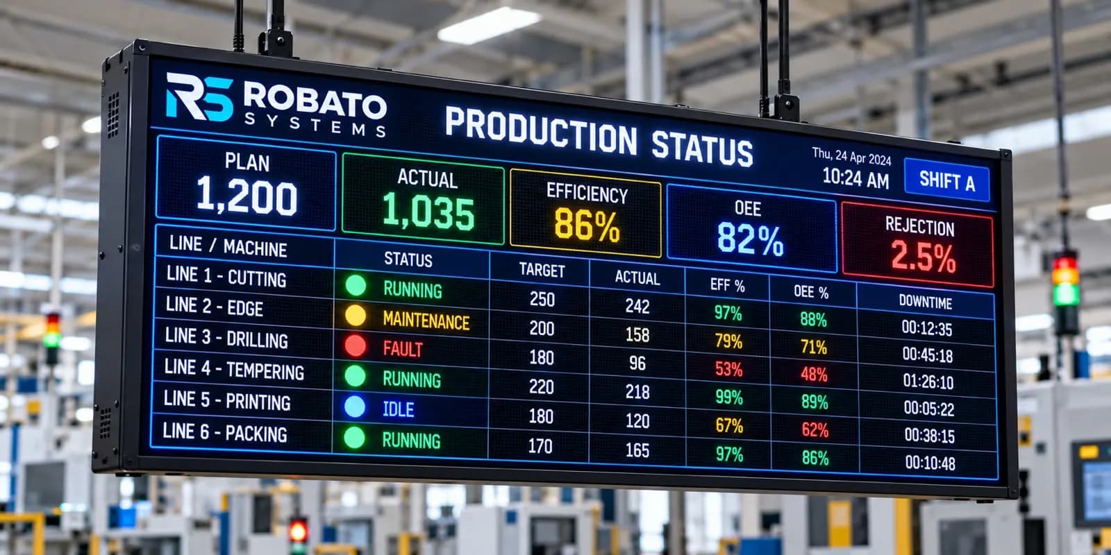
Machine 01 - Running
Machine 02 - Stopped - 06 min
Machine 03 - Running
Machine 04 - Breakdown - 18 min
This gives supervisors immediate visibility into the current condition of the production floor.
Real-time monitoring is especially valuable when downtime escalation is required.
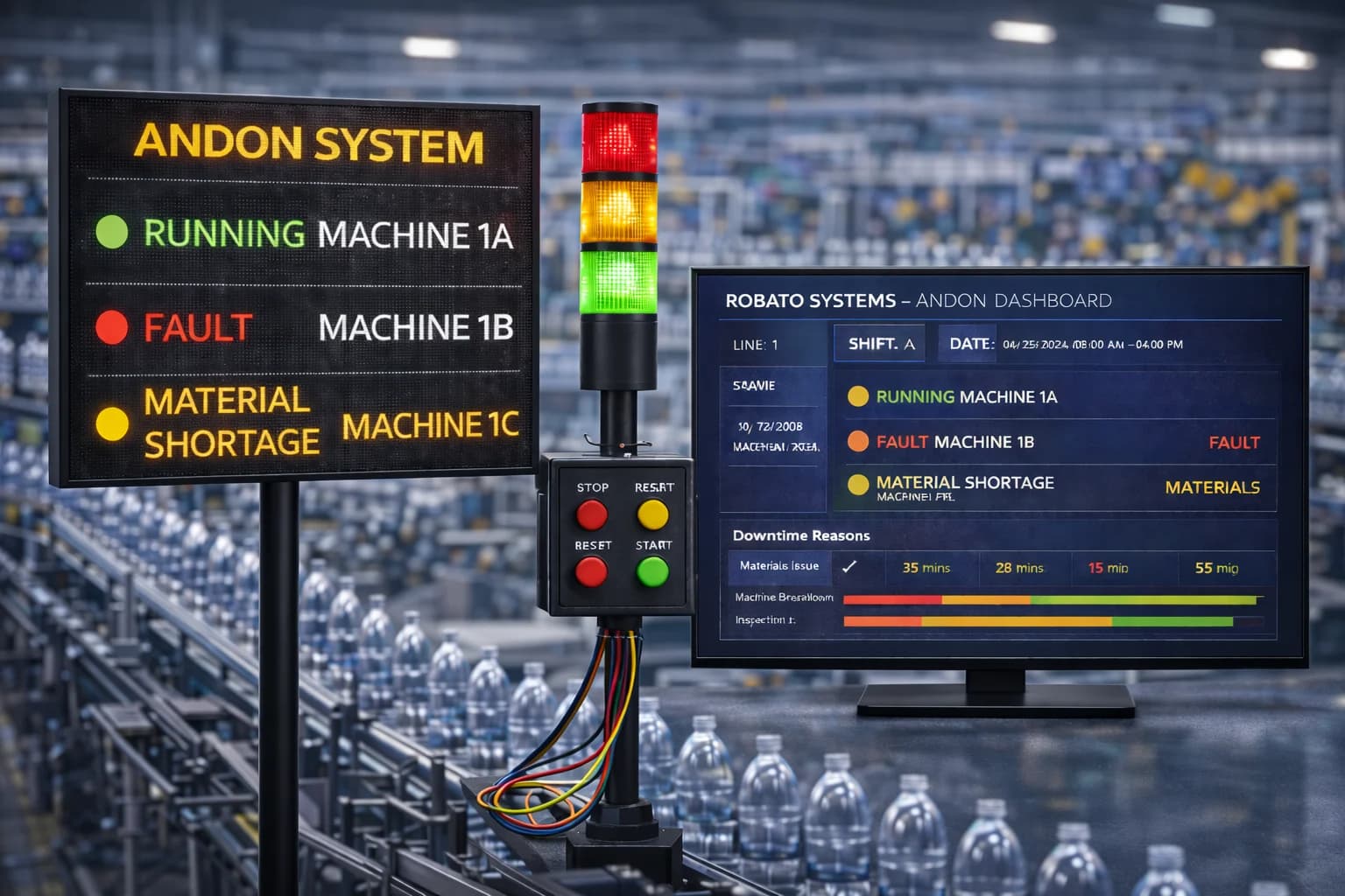
Downtime Alerts on the Dashboard
Dashboards can also be combined with downtime alerts.
For example, a plant may define thresholds such as:
5 minutes: Monitor
10 minutes: Supervisor notification
20 minutes: Maintenance escalation
30 minutes: Management escalation
The exact thresholds should depend on the machine, process, and production requirements.
This approach helps prevent long-running downtime events from going unnoticed.
Designing a Machine-Wise Downtime View
The machine-wise section should allow users to quickly identify problem equipment.
Useful information includes:
- Machine name
- Current status
- Total downtime
- Number of events
- Average downtime
- Availability
- Primary downtime reason
Sorting machines by total downtime is particularly useful because it puts the highest-impact equipment at the top.
Designing a Downtime Reason Analysis
Reason analysis should provide more than a simple list.
A useful dashboard can show:
Downtime Reason → Duration → Event Count → Percentage of Total Downtime
For example:
| Downtime Reason | Duration | Events |
|---|---|---|
| Mechanical Breakdown | 240 min | 8 |
| Material Shortage | 125 min | 12 |
| Changeover | 90 min | 5 |
| Quality Issue | 55 min | 4 |
This helps teams identify both frequent and high-duration problems.
Pareto Analysis for Downtime
Pareto analysis is particularly useful for downtime management.
Instead of trying to solve every downtime reason simultaneously, manufacturers can focus on the small number of causes responsible for most of the lost time.
For example:
- Mechanical failure
- Material shortage
- Changeover
- Tool failure
- Quality issue
If the first two categories account for most downtime, improvement teams can prioritize them first.
Downtime KPI Dashboard Filters
Dashboard filters make the data more useful for different users.
Recommended filters include:
- Date
- Shift
- Machine
- Production line
- Department
- Downtime category
- Downtime reason
- Product
- Operator
For example, a plant manager may want to view the entire factory, while a production supervisor may only need information for one production line.
Dashboard Drill-Down
A useful downtime dashboard should allow users to move from summary information to detailed information.
For example:
Total Downtime: 480 minutes
Clicking the KPI could show:
Machine B: 180 minutes
Clicking Machine B could show:
- Breakdown: 100 minutes
- Material shortage: 50 minutes
- Changeover: 30 minutes
Clicking the breakdown category could then display individual downtime events.
This type of drill-down helps teams move from "What happened?" to "Why did it happen?"
Downtime Dashboard for Production Managers
Production managers typically need a high-level operational view.
Their dashboard should focus on:
- Total downtime
- Machine availability
- Production loss
- Top downtime machines
- Major downtime reasons
- Shift performance
- Downtime trends
The objective is to identify production bottlenecks and prioritize improvement activities.
Downtime Dashboard for Maintenance Teams
Maintenance teams require more detailed information.
Useful maintenance KPIs include:
- Breakdown frequency
- Breakdown duration
- Machine-wise downtime
- Failure trends
- Average downtime
- Longest breakdown
- Repeated failure reasons
This information can support preventive maintenance planning and equipment reliability improvements.
Downtime Dashboard for Plant Heads
Plant heads generally need a broader operational perspective.
Their dashboard can combine:
- Total plant downtime
- Availability
- Production loss
- Top problem machines
- Major downtime categories
- Shift comparison
- Historical trends
This provides a quick overview without requiring the plant head to examine individual machine events.
Connecting Downtime KPIs With OEE
Downtime should not be analyzed in isolation.
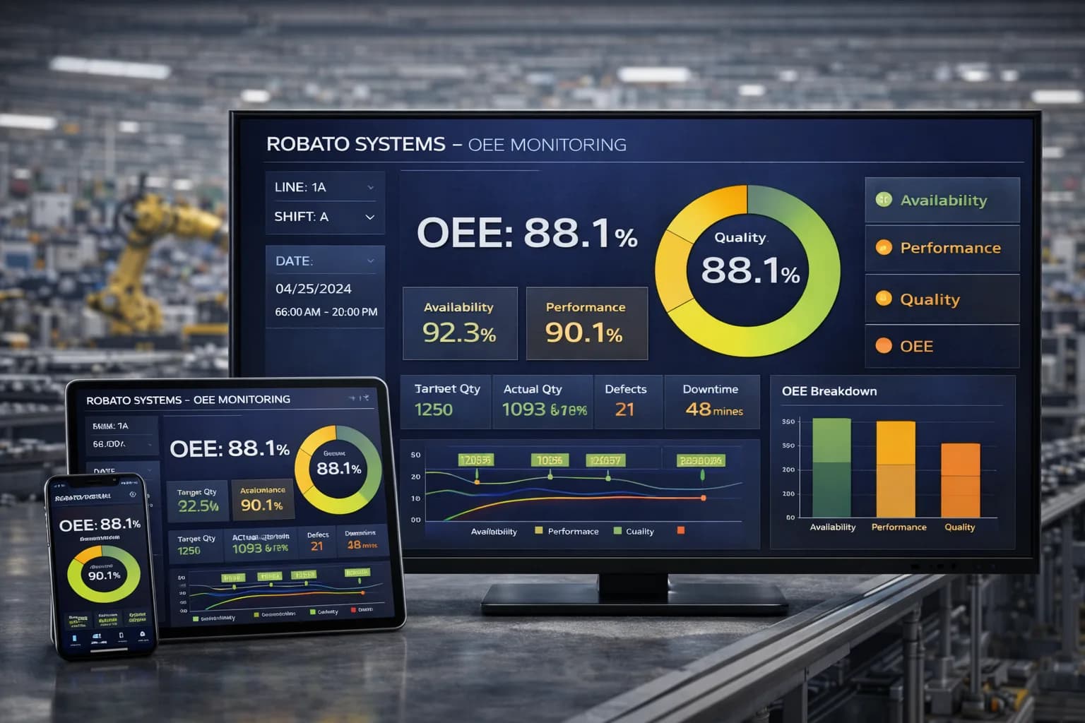
Production teams can connect downtime information with OEE metrics such as:
- Availability
- Performance
- Quality
For example, a machine may have excellent quality performance but poor availability because of frequent breakdowns.
Another machine may have high availability but poor performance because of slow cycles.
Combining these metrics provides a more complete picture of manufacturing efficiency.
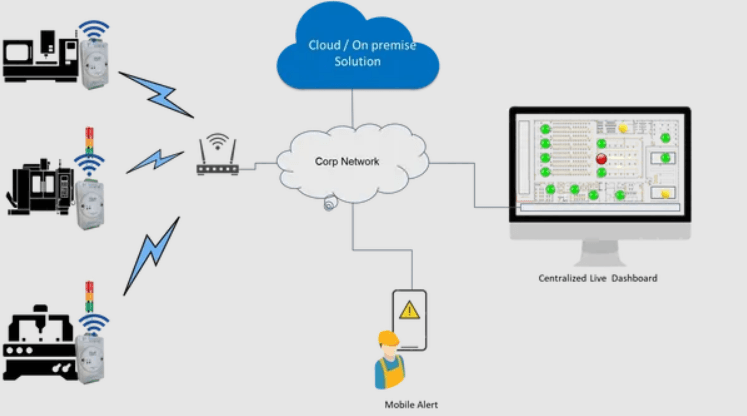
Automated Data Collection for Downtime Dashboards
The accuracy of a dashboard depends on the quality of its underlying data.
Automated systems can collect machine status information using:
- PLCs
- Sensors
- Machine controllers
- Industrial gateways
- Digital inputs
- IoT devices
The collected information can then be processed by downtime monitoring software.
A typical architecture is:
Machine → PLC/Sensor → Gateway → Monitoring Platform → Database → Dashboard
This reduces manual data entry and provides faster access to machine information.
Manual vs Automated Downtime Dashboards
Manual Dashboard
Data is entered through:
- Paper forms
- Excel
- Operator entries
Advantages include low initial complexity, but data accuracy and real-time visibility can be limited.
Automated Dashboard
Machine data is collected automatically and displayed in the dashboard.
Advantages include:
- Real-time visibility
- Consistent data
- Reduced manual work
- Automated reports
- Faster analysis
- Better historical tracking
For larger manufacturing environments, automated monitoring generally provides greater scalability.
Common Mistakes When Designing a Downtime Dashboard
Showing Too Many KPIs
A dashboard containing dozens of metrics can become difficult to understand.
Focus on KPIs that support specific decisions.
Using Inconsistent Downtime Categories
If operators use different names for the same problem, analysis becomes unreliable.
Standardize downtime categories.
Ignoring Historical Data
Real-time information is useful, but historical trends are necessary to identify recurring problems.
Focusing Only on Total Downtime
Total downtime does not explain why the downtime occurred.
Always provide machine-wise and reason-wise analysis.
Not Separating Planned and Unplanned Downtime
This can distort equipment performance analysis.
Creating a Dashboard Without Actionable Information
Every major KPI should help answer a practical question.
For example:
Which machine requires attention?
What is causing the most downtime?
Which shift has the highest downtime?
Is downtime improving?
Best Practices for Downtime KPI Dashboard Design
Keep the Most Important KPIs at the Top
Users should understand overall performance within seconds.
Use Consistent Units
Use minutes or hours consistently throughout the dashboard.
Provide Time Filters
Allow users to compare different time periods.
Highlight Exceptions
Long downtime events and machines with unusually high downtime should be easy to identify.
Use Drill-Downs
Allow users to move from plant-level information to individual downtime events.
Connect Data With Production Performance
Downtime should be connected with production and OEE information whenever possible.
Make the Dashboard Role-Based
Production, maintenance, supervisors, and management may require different information.
How a Downtime KPI Dashboard Helps Reduce Downtime
The dashboard itself does not physically repair a machine or eliminate a production problem.
Its value comes from improving visibility and decision-making.
The improvement cycle can be:
Monitor → Identify → Analyze → Act → Measure
For example:
Monitor: Machine B has high downtime.
Identify: Mechanical breakdown is the primary cause.
Analyze: A recurring component is failing.
Act: Maintenance changes the component and improves the maintenance schedule.
Measure: Downtime is monitored over the following weeks.
This creates a continuous improvement process.
Downtime KPI Dashboards and Industry 4.0
Downtime monitoring is an important part of smart manufacturing.
An Industry 4.0 environment can connect machine data, production data, quality information, maintenance records, and operational dashboards.
This creates greater visibility across the factory.
Instead of waiting until the end of a shift to discover production losses, teams can monitor machine performance while production is happening.
Downtime KPI Dashboard With Robato Systems
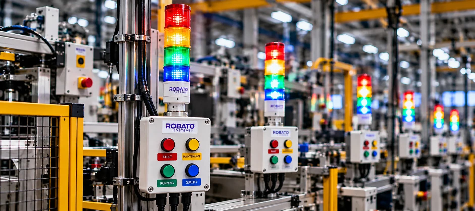
Robato Systems provides manufacturing monitoring solutions designed to help production teams gain better visibility into machine and operational performance.
A downtime monitoring solution can centralize machine status, downtime events, downtime reasons, and performance information into a digital dashboard.
By replacing disconnected manual records with centralized monitoring, manufacturers can make downtime information more accessible to production and maintenance teams.
The resulting visibility can support faster response, better downtime analysis, and continuous production improvement.
Conclusion
A well-designed downtime KPI dashboard can transform the way manufacturers understand production losses.
Instead of relying on paper records and spreadsheets, production teams can use centralized dashboards to monitor total downtime, downtime events, machine performance, downtime reasons, shifts, trends, and equipment availability.
The most effective dashboards do not simply display numbers. They help users identify problems and decide what action should be taken.
By combining accurate machine data, meaningful KPIs, real-time monitoring, historical analysis, and clear visualization, manufacturers can build a stronger approach to downtime management.
The ultimate objective is simple:
Identify downtime faster, understand its causes, take corrective action, and prevent repeated production losses.
FAQs
What is a downtime KPI dashboard?
A downtime KPI dashboard is a digital dashboard that displays key metrics related to machine and production downtime, helping teams monitor, analyze, and reduce production losses.
What KPIs should be included in a downtime dashboard?
Important KPIs include total downtime, downtime events, average downtime, maximum downtime, machine-wise downtime, reason-wise downtime, shift-wise downtime, planned versus unplanned downtime, and machine availability.
Why is machine-wise downtime important?
Machine-wise downtime helps identify which equipment contributes the most production loss, allowing production and maintenance teams to prioritize improvement efforts.
What is reason-wise downtime analysis?
Reason-wise downtime analysis categorizes downtime according to its cause, such as breakdown, material shortage, changeover, tooling, or quality issues.
Can a downtime KPI dashboard work in real time?
Yes. When connected to PLCs, sensors, machine controllers, or industrial gateways, a downtime dashboard can display machine status and downtime information in real time.
How does a downtime dashboard help maintenance teams?
It helps maintenance teams identify frequently failing machines, recurring downtime reasons, long breakdowns, and failure trends that can support preventive maintenance activities.
Should planned downtime be included in a downtime dashboard?
Yes, but planned and unplanned downtime should be clearly separated so that equipment performance is not incorrectly evaluated.
How is downtime connected to OEE?
Downtime affects machine availability, which is one of the three main components of OEE along with performance and quality.