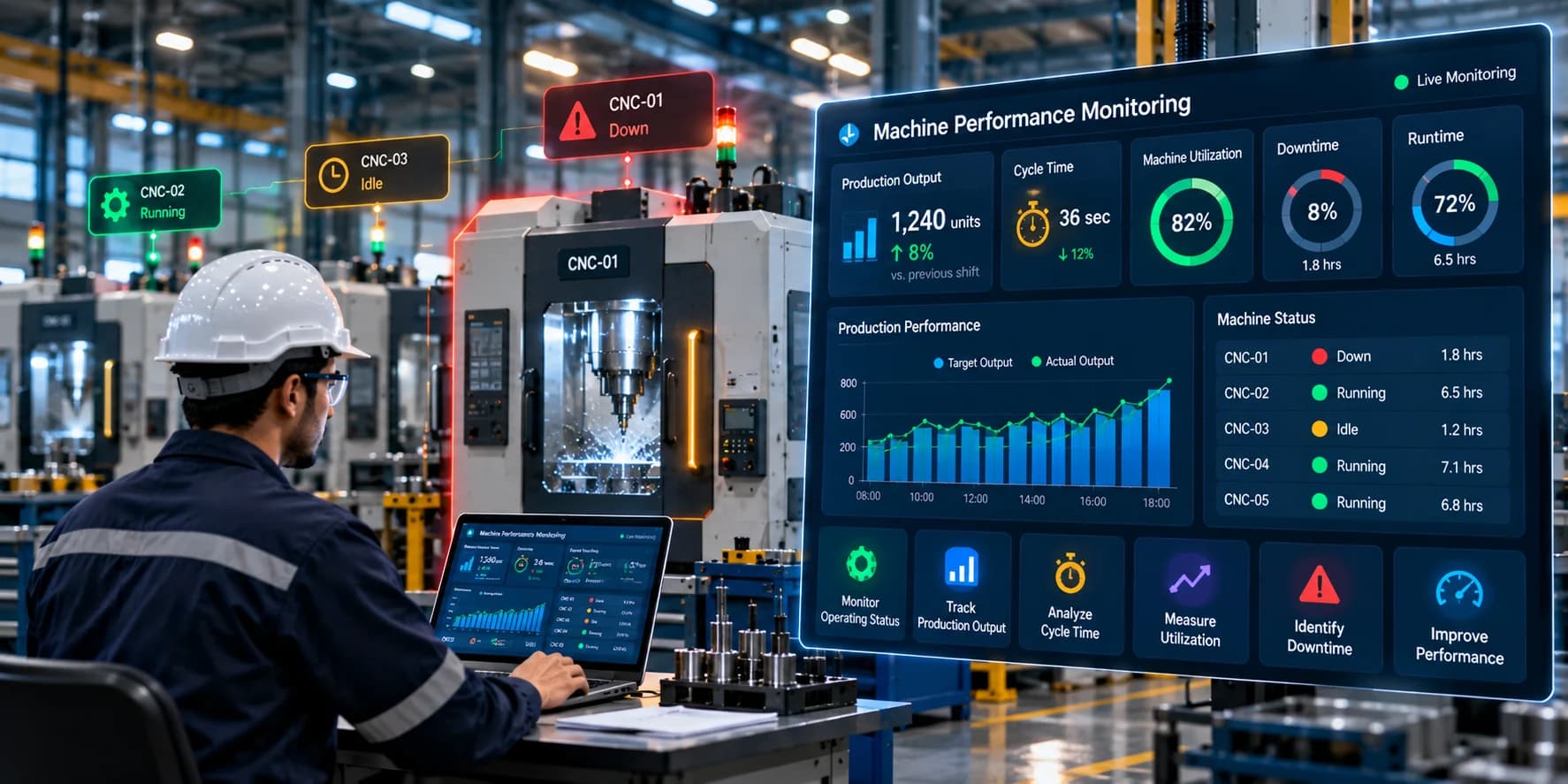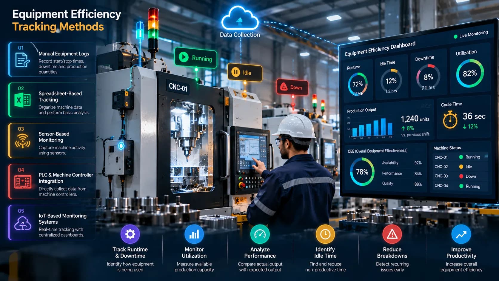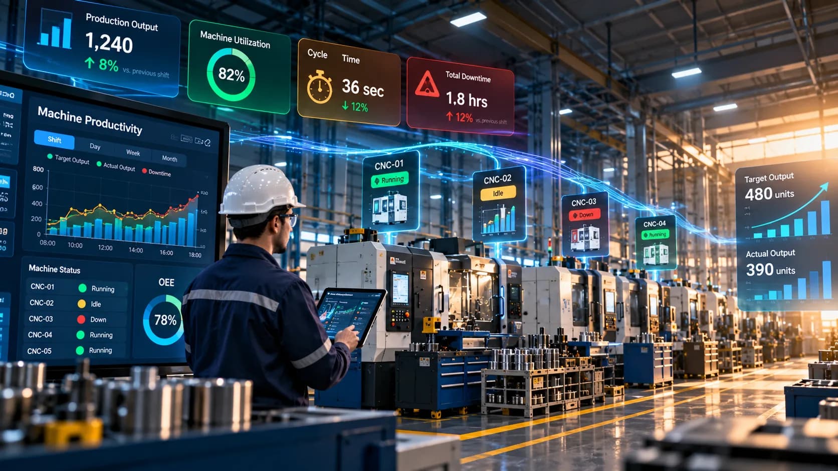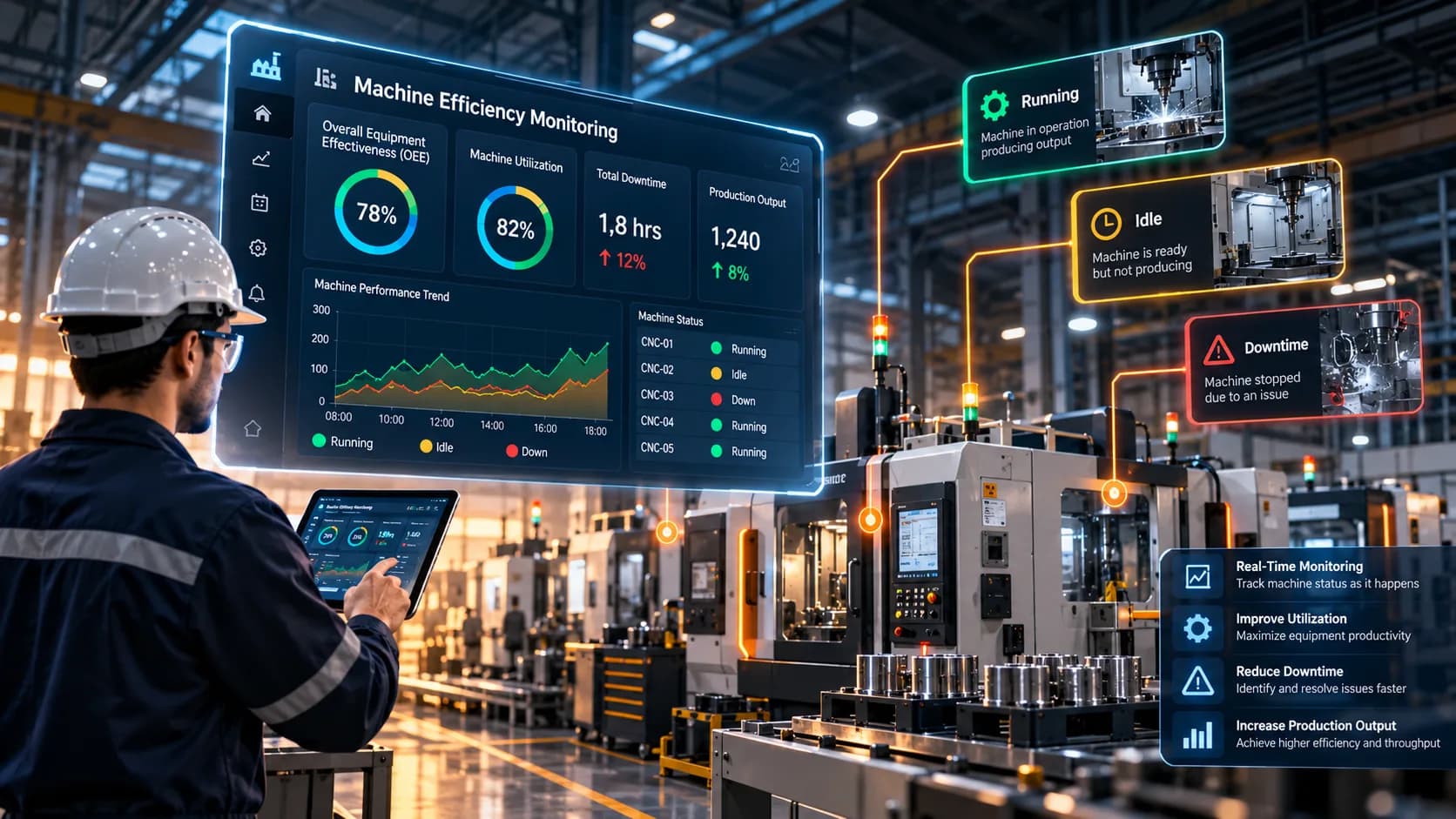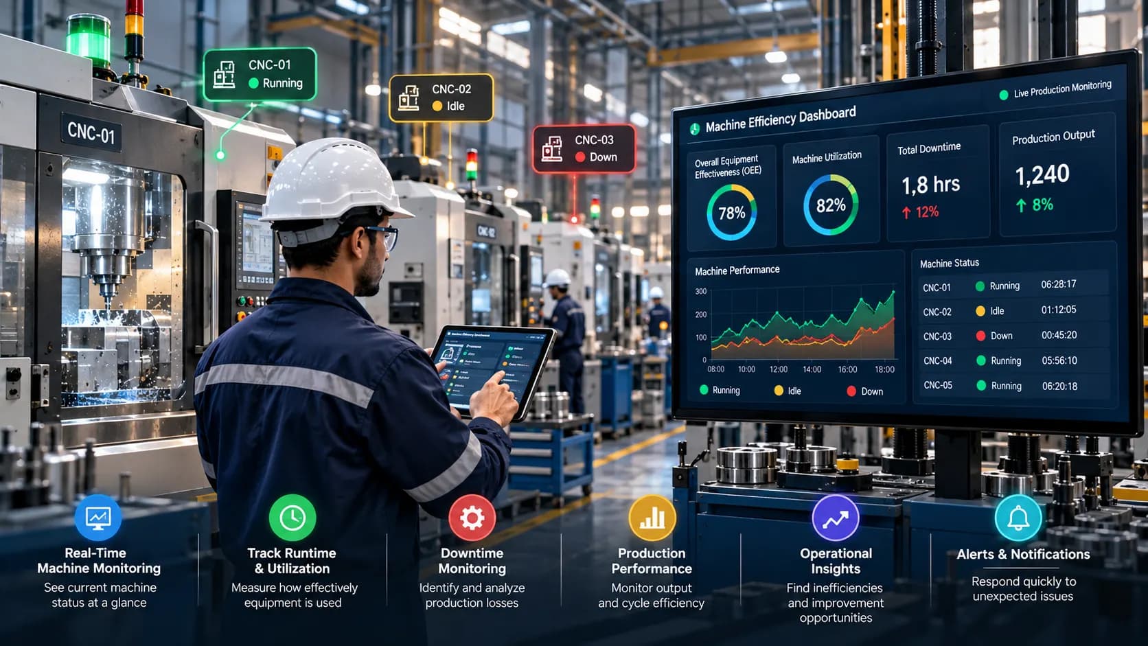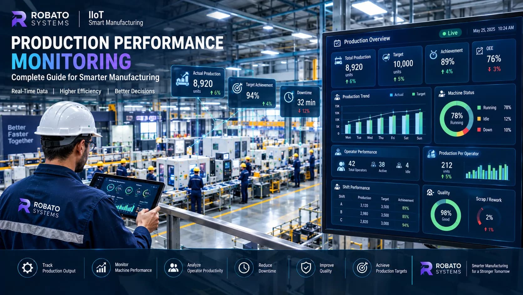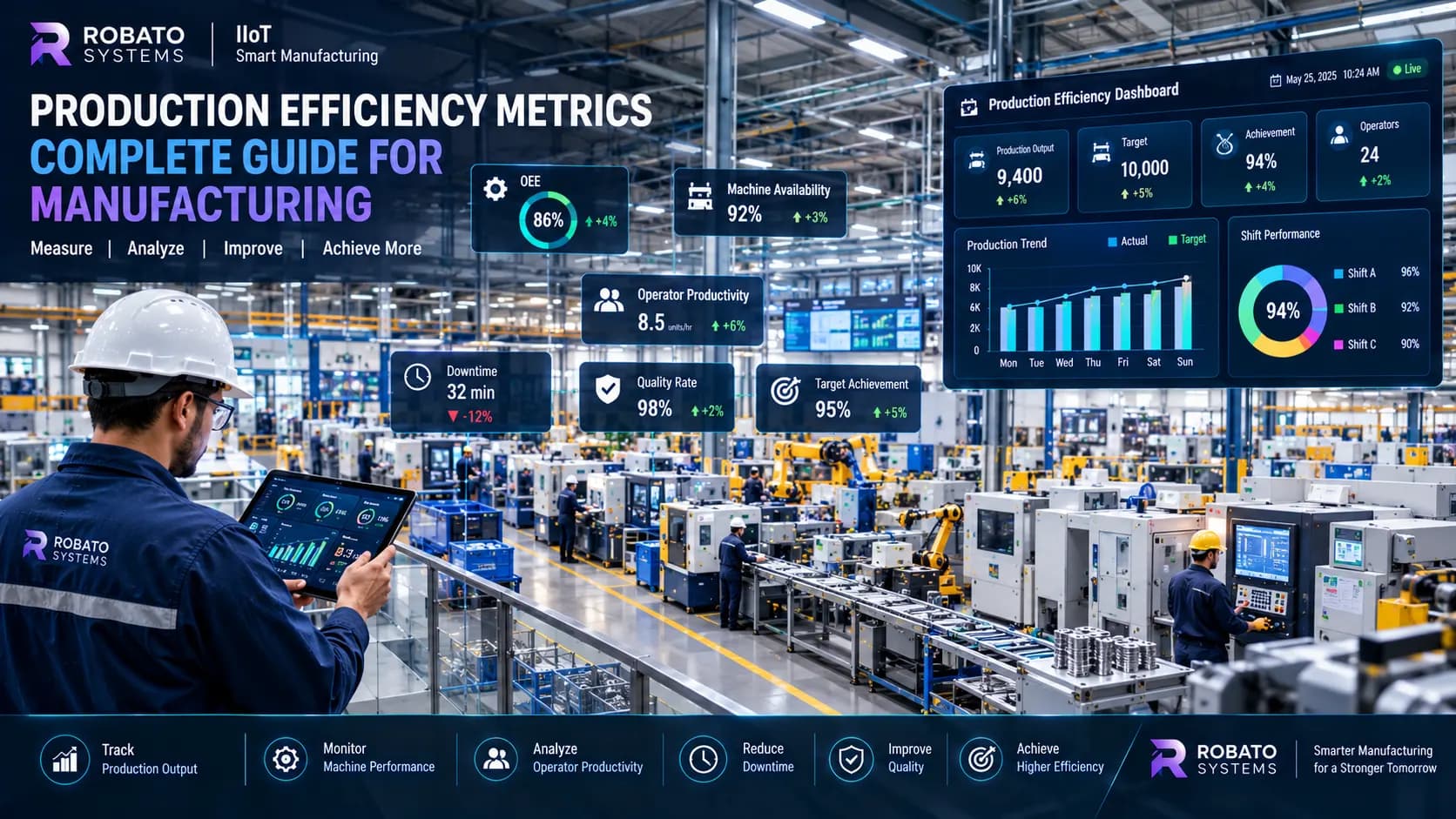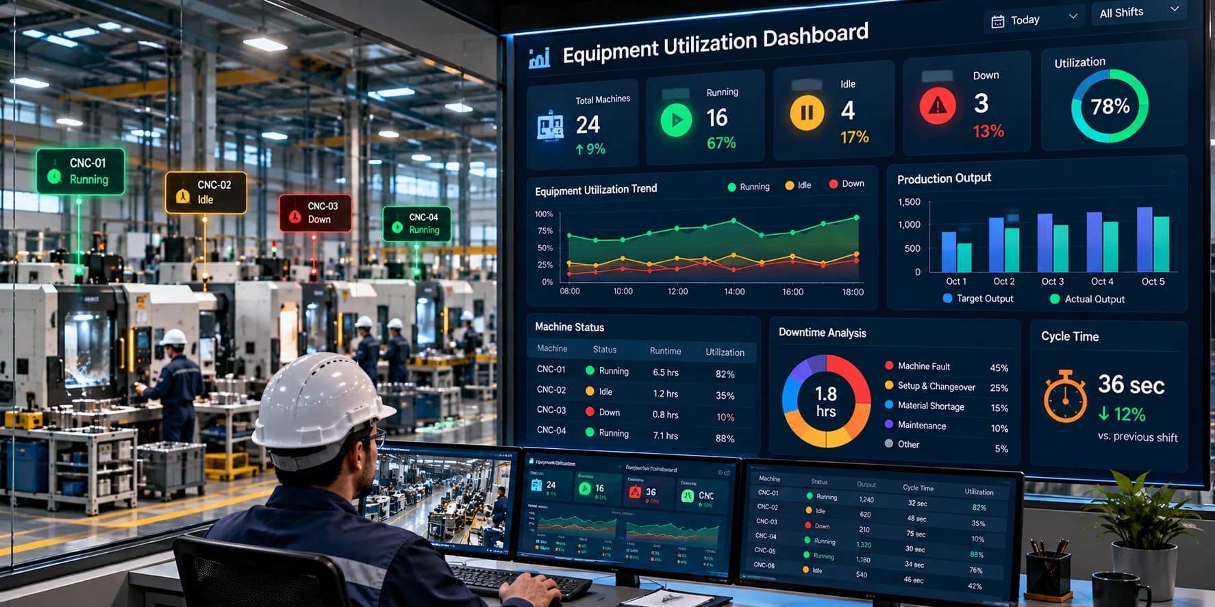
Manufacturers need a clear understanding of how effectively their equipment is being used to plan production, manage capacity, and identify operational losses. However, when machine information is scattered across spreadsheets, operator logs, production reports, and different monitoring systems, getting an accurate picture of equipment utilization becomes difficult.
An Equipment Utilization Dashboard brings important equipment data together in a centralized view. It helps production managers understand which machines are operating, which are idle, how much capacity is being used, and where equipment usage may be falling below expectations.
A well-designed dashboard does more than display machine status. It connects operational data with meaningful performance indicators, allowing teams to compare utilization across machines, shifts, and production lines.
This guide explains what an equipment utilization dashboard is, which metrics it should include, how to design an effective dashboard, and the best practices manufacturers should follow to turn equipment data into actionable insights.
What Is an Equipment Utilization Dashboard?
An equipment utilization dashboard is a digital interface that displays information about how industrial machines and production equipment are being used over a selected period.
It collects and presents relevant information through visual indicators, charts, tables, and reports.
Depending on the monitoring system, a dashboard may display:
Current machine status
Equipment operating time
Idle time
Downtime
Equipment utilization percentage
Production output
Machine availability
Shift-wise utilization
Historical utilization trends
Machine-level comparisons
For example, a production manager overseeing 25 machines may use a single dashboard to identify which machines are operating normally and which have spent a significant portion of their available time idle.
Without centralized monitoring, obtaining the same information may require reviewing multiple production records or manually contacting supervisors.
The primary purpose of the dashboard is to make equipment usage visible, measurable, and easier to analyze.
Why Do Manufacturers Need an Equipment Utilization Dashboard?
Equipment represents a significant investment in manufacturing. When machines remain unused for extended periods or operate below their expected capacity, the factory may not be making full use of its available production resources.
An equipment utilization dashboard helps manufacturers answer practical questions:
Which machines are being used most effectively?
Which machines have consistently low utilization?
How much time was lost to downtime?
Which production shifts experienced the lowest equipment usage?
Are production bottlenecks affecting machine utilization?
Is available capacity sufficient for upcoming orders?
Where should operational improvements be prioritized?
These questions become particularly important in factories operating multiple production lines, several shifts, or equipment from different manufacturers.
A centralized dashboard provides a consistent view of equipment usage and helps teams identify where further investigation is needed.
Key Metrics to Include in an Equipment Utilization Dashboard
The usefulness of a dashboard depends on the quality and relevance of its metrics. The goal should be to present information that supports decisions rather than filling the screen with unnecessary numbers.
1. Equipment Utilization Percentage
Equipment utilization is one of the most important dashboard metrics.
A commonly used formula is:
Equipment Utilization (%) = Actual Operating Time ÷ Available Production Time × 100
For example, suppose a machine is available for 8 hours and operates for 6 hours.
Equipment utilization = 6 ÷ 8 × 100 = 75%
This means the machine operated for 75% of the defined available production time.
The organization should clearly define available production time. Scheduled maintenance, planned breaks, and non-production periods may need to be treated separately depending on the purpose of the calculation.
2. Machine Runtime
Runtime indicates how long a machine has been actively operating during a selected period.
A dashboard can display runtime by machine, shift, production line, or date range.
Runtime is useful for understanding equipment usage, but it should not be treated as proof of productivity. A machine can run for a long time while producing below its expected rate.
3. Downtime
Downtime represents periods when a machine is stopped or unavailable for production.
Useful dashboard indicators include:
Total downtime
Planned versus unplanned downtime
Downtime by shift
Recurring stoppages
Where possible, downtime should be classified by reason so teams can investigate the causes of lost production time.
4. Idle Time
Idle time occurs when equipment is available but not actively producing.
Common causes include material shortages, operator waiting, production scheduling issues, changeovers, and upstream or downstream process delays.
Separating idle time from equipment failure can help managers identify problems that maintenance activity alone will not resolve.
5. Machine Availability
Availability indicates the proportion of scheduled production time during which equipment is ready for operation.
A common calculation is:
Availability (%) = Operating Time ÷ Planned Production Time × 100
The precise definition should match the factory's reporting standards.
6. Production Output
Production output measures the number of units, parts, or cycles completed during a specified period.
Including output alongside utilization helps managers distinguish between equipment that is heavily used and equipment that is producing effectively.
7. Shift-Wise Utilization
Shift-wise utilization allows managers to compare equipment usage across different production periods.
It can reveal differences associated with production scheduling, material availability, changeovers, staffing, or machine downtime.
Comparisons should account for differences in planned workloads and production requirements.
8. Utilization Trends
Historical charts show how utilization changes over time.
Daily, weekly, and monthly views can help identify recurring patterns that may not be visible from a single day's results.
How to Design an Effective Equipment Utilization Dashboard
Dashboard design should begin with the decisions users need to make.
A production supervisor needs immediate operational visibility, while a plant manager may need a summarized view of capacity and utilization trends.
1. Start With High-Priority Information
Place the most important indicators near the top of the dashboard.
A practical layout may include:
Overall equipment utilization
Machines currently running
Machines currently idle
Machines currently stopped
Total downtime
Production output
This gives users an immediate overview before they examine individual machines.
2. Use Clear Machine Status Indicators
Machine status should be easy to understand at a glance.
For example, a dashboard may distinguish between running, idle, stopped, fault, and maintenance states.
Use consistent labels and accessible visual indicators. Do not rely on colour alone; text labels or icons should also communicate the state.
3. Provide Machine-Level Details
An overall utilization percentage can hide significant differences between machines.
A machine-level table should allow users to compare utilization, runtime, downtime, and other relevant indicators.
This makes it easier to identify equipment that needs attention.
4. Include Filters
Useful filters may include:
Date range
Machine
Production line
Department
Shift
Machine category
Filters help users investigate specific production conditions without overwhelming the main dashboard.
5. Support Historical Analysis
A dashboard should provide more than current machine status.
Historical views help users compare utilization across days, shifts, and weeks to identify recurring patterns.
6. Make Important Exceptions Visible
Dashboards should highlight conditions that require investigation, such as extended idle periods or unusually high downtime.
Alerts should be based on meaningful thresholds rather than generating notifications for every minor event.
7. Design for Different Screen Sizes
Factory dashboards may be displayed on desktop computers, control-room monitors, tablets, or other operational screens.
Important metrics should remain readable across supported screen sizes.
Example of an Equipment Utilization Dashboard
Consider a factory with three production machines. The following example illustrates how a dashboard might present utilization data for a single shift.
| Machine | Available Time | Operating Time | Utilization |
|---|---|---|---|
| Machine A | 8 hours | 7 hours | 87.5% |
| Machine B | 8 hours | 5 hours | 62.5% |
| Machine C | 8 hours | 6 hours | 75% |
Machine B has the lowest utilization in this example.
The dashboard helps identify where to investigate, but the utilization figure does not explain the cause. The production team may need to examine idle time, downtime records, material availability, production schedules, or machine conditions.
This distinction is important: a dashboard identifies patterns; operational analysis explains them.
Real-Time vs. Historical Utilization Dashboards
Both real-time and historical views are useful, but they support different decisions.
Real-Time Equipment Utilization
Real-time or near-real-time monitoring helps supervisors understand the current state of connected machines.
It can support faster responses to:
Unexpected stoppages
Extended idle periods
Production interruptions
Equipment availability changes
The actual update frequency depends on machine connectivity, data processing, and the monitoring platform.
Historical Equipment Utilization
Historical dashboards help managers identify patterns over longer periods.
They can support:
Shift comparisons
Weekly utilization reviews
Capacity planning
Recurring downtime analysis
Production planning
Continuous improvement
An effective dashboard combines immediate operational visibility with historical analysis.
Equipment Utilization Dashboard vs. Production Dashboard
These dashboards may share some metrics, but their main objectives differ.
| Equipment Utilization Dashboard | Production Dashboard |
|---|---|
| Focuses on equipment usage | Focuses on production results |
| Utilization percentage | Units produced |
| Runtime and idle time | Target versus actual output |
| Equipment availability | Production rate |
| Downtime by machine | Order or product performance |
| Capacity usage | Production progress |
Some manufacturers combine these views into a single platform. This can be useful when machine usage and production output need to be analyzed together.
How an Equipment Utilization Dashboard Helps Improve Capacity Planning
Capacity planning requires an understanding of how much equipment capacity is available and how effectively it is being used.
A utilization dashboard provides historical evidence that can help manufacturers evaluate whether existing equipment may be sufficient for planned production.
For example, consistently low utilization across comparable machines may justify investigating scheduling or workload distribution before investing in additional equipment.
However, low utilization does not automatically mean a machine is unnecessary. Demand fluctuations, product requirements, redundancy, maintenance needs, and future production plans must also be considered.
The dashboard provides information for better decisions; it should not replace operational and financial analysis.
Common Equipment Utilization Dashboard Mistakes
Tracking Too Many Metrics
A crowded dashboard makes important information difficult to find.
Start with the metrics that directly support operational decisions and add more only when necessary.
Using Inconsistent Formulas
If different departments calculate utilization differently, comparisons become unreliable.
Standardize the calculation and document how planned downtime and non-production periods are treated.
Ignoring Idle Time
A machine may be available but not producing. Tracking only breakdowns can therefore miss important capacity losses.
Showing Percentages Without Context
A utilization percentage is more useful when users can also see the underlying operating time, available time, and relevant production conditions.
Focusing Only on Real-Time Data
Real-time monitoring helps with immediate response, but historical trends are needed to understand recurring issues.
Ignoring Data Accuracy
Incorrect machine signals or inconsistent state definitions can produce misleading dashboard results.
Generating Too Many Alerts
Excessive alerts can lead to notification fatigue. Configure alerts around meaningful operational conditions.
Best Practices for Equipment Utilization Dashboard Implementation
Define Clear Objectives
Determine whether the dashboard is intended to reduce idle time, improve capacity planning, monitor machine availability, or support another specific goal.
Standardize Machine States
Use consistent definitions for running, idle, stopped, fault, and maintenance conditions.
Validate Data Sources
Check that machine signals and operating-time calculations accurately reflect real equipment activity.
Choose Relevant KPIs
Select indicators that help users identify issues and take action.
Establish Baselines
Collect historical information before setting improvement targets.
Configure Role-Based Views
Operators, supervisors, and management teams often need different levels of detail.
Review Trends Regularly
Use daily operational reviews and longer-term performance reviews to identify recurring patterns.
Connect Insights to Action
Assign responsibility for investigating issues identified through the dashboard.
Review Dashboard Effectiveness
As operational requirements change, reassess whether the dashboard still provides the information users need.
How to Implement an Equipment Utilization Dashboard
A structured implementation process helps ensure that the dashboard provides accurate and useful information.
Step 1: Assess the Existing Equipment
Document machines, production lines, available controllers, sensors, and communication interfaces.
Step 2: Define Utilization Rules
Agree on the meaning of available time, operating time, downtime, idle time, and planned maintenance.
Step 3: Select the Data Collection Method
Depending on the equipment, information may be collected through PLCs, sensors, industrial gateways, machine counters, or existing production systems.
Step 4: Connect the Equipment
Establish reliable communication between the equipment and the monitoring platform.
Older machines may require additional sensors or connectivity hardware.
Step 5: Configure Metrics
Set up utilization formulas, machine-state logic, downtime categories, and other required calculations.
Step 6: Design the Dashboard
Create an overview of key indicators alongside machine-level details, filters, and historical charts.
Step 7: Validate the Results
Compare dashboard readings with actual machine activity and existing production records.
Correct any inconsistencies before relying on the dashboard for operational decisions.
Step 8: Train Users
Explain how to interpret the metrics, investigate unusual results, and report data issues.
Step 9: Measure Improvement
Track whether the dashboard helps teams identify capacity losses and implement effective corrective actions.
Choosing Equipment Utilization Dashboard Software
When selecting a dashboard platform, manufacturers should consider the complete operational environment rather than focusing only on its visual design.
Important considerations include:
Machine connectivity: Compatibility with existing controllers, sensors, and communication interfaces.
Real-time visibility: Appropriate data update frequency for operational requirements.
Historical reporting: Ability to review and compare past equipment performance.
Scalability: Support for additional machines, lines, and facilities.
Integration: Compatibility with MES, ERP, maintenance, and other relevant systems.
Security: Suitable access controls, authentication, and protection for operational data.
Customization: Ability to configure metrics and views for different users.
Usability: Clear presentation that operators and managers can understand.
Data reliability: Accurate machine-state interpretation and consistent calculations.
The right solution depends on the factory's size, machine types, reporting requirements, and existing industrial infrastructure.
Frequently Asked Questions
What is an equipment utilization dashboard?
An equipment utilization dashboard is a digital interface that displays equipment operating time, idle time, downtime, utilization percentages, and other indicators to help manufacturers understand how their machines are being used.
What KPIs should an equipment utilization dashboard include?
Common KPIs include equipment utilization, runtime, downtime, idle time, availability, production output, and shift-wise utilization. The appropriate metrics depend on the manufacturing process and operational objectives.
How do you calculate equipment utilization?
A common formula is actual operating time divided by available production time, multiplied by 100. The organization should clearly define available production time and apply the same calculation consistently.
Can an equipment utilization dashboard show real-time machine status?
Yes, provided the machines are connected to a suitable monitoring platform. The dashboard can display current machine states, although the update frequency depends on the underlying infrastructure.
What is the difference between equipment utilization and availability?
Utilization measures how much of a defined available period equipment is used for operation. Availability measures whether equipment is ready for production during its scheduled production time. Their exact definitions depend on the calculation method used.
Can older machines be connected to an equipment utilization dashboard?
Yes. Depending on the machine, connectivity can be established through sensors, PLC interfaces, industrial gateways, or other suitable data collection methods.
Does a higher utilization percentage always mean better performance?
No. High utilization can be desirable, but it does not automatically indicate high productivity, good product quality, or effective maintenance. The metric should be evaluated alongside production output, downtime, quality, and business requirements.
Can an equipment utilization dashboard help reduce downtime?
It can make downtime visible and help teams identify recurring patterns. Reducing downtime requires investigating the underlying causes and implementing appropriate corrective actions.
Can one dashboard monitor multiple production lines?
Yes. A centralized dashboard can display information from multiple connected machines and production lines, subject to the monitoring platform's capabilities and integration architecture.
Conclusion
An Equipment Utilization Dashboard helps manufacturers understand how effectively their existing equipment capacity is being used.
By combining utilization percentages, runtime, idle time, downtime, availability, production output, and historical trends, the dashboard provides a clearer view of equipment activity across machines and production lines.
The most effective dashboards are built around reliable data, standardized calculations, clear visualizations, and practical operational objectives. They help teams identify where capacity may be lost, investigate recurring issues, and evaluate whether improvement initiatives are working.
For manufacturers seeking better production visibility, an equipment utilization dashboard can provide a useful foundation for more informed capacity planning and continuous improvement.
The key is to move beyond displaying numbers and build a monitoring process in which reliable equipment data leads to meaningful operational decisions.
Suggested CTA: Looking to improve equipment visibility across your factory? Explore machine efficiency monitoring solutions to understand machine usage, identify operational losses, and make better-informed production decisions.